As I have already explained there were twenty people that took part in the questinnaire for the poster. This was done so that there was a wide spectrum of opinions.
Results analysis:
1. Gender?
Male: 50% / Female: 50%
I purposely chose to have an equal amount of male female candidates to take part so that the results would appear to be more fair.
2. Do you watch horror films?
Yes - Regular: 30% / No - Never: 10% / Sometimes: 60%
Judging from these results, most of the candidates do watch horror films sometimes, and there were a few that watched regularly. It works well that there were people in each callibre as it allows a difference of opinion for the questionnaire. For example, the regualr horror film watchers will have a very different opinion to those who never watch horror, but this would work as it could help see the broad variety of opinions in researching how to make the poster work best.
3. What is the purpose of a film poster?
To sell the film - 70% / To give an in sight to the film - 30% / Every other film has one - 0%
The answers given in this question were really interesting as the obvious contenders were the first two, hence the reason they received all the votes. Most people believed that the main purpose was to sell the film, which in fairness could be argued well, as a good poster that appears interesting could really work effectively in making people wating to view the trailer, and from there having the trailer convince them to go and see the film. It is also understandable that the second choice was picked as it does give a slight in sight to the film. For instance, when we see the poster of 'Saw', we know that the film will be gory. This question shows that there should be a massive focus on making the poster as interesting as possible so that an in sight can be given and so that it will sell.
4. What makes a good film poster?
Popular answers: Colours / Picture / Font
This question based around the candidates to write down their opinions. The most popular answers was the ones states above (colours, picture and font). This question links in well with the previous question because the answers given are all factors in making the poster stand out and work well in order to achieve making the poster interesting enough to make people want to watch the film and give an in sight to the film.
5. What do you think are good conventions for a horror film poster?
Popular: Blood / Weapon / Villain
Again this question is similar to the previous one in the sense that it was for the candidates to write down their opinions with the most popular being blood, villain or weapon. In fact most horror posters do follow these conventions in which they have blood, weaponry or the villain, as it allows the poster to boast the genre.
6. Pick two colours that would best suit a horror film poster?
Popular: Red / Black / White
The colours picked for this question were quite likely to be picked as a lot of horror posters use these colours. The black shows off darkness, the white can show purity and the blood and red connotes death.
Friday, 10 February 2012

Thursday, 9 February 2012
Questionnaire results
As stated before, I designed a questionnaire to help in the creation of the poster. I thought, I would try to make it as broad as possible and so therefore made sure that there was an equal amount of male and female participents (20 people were surveyed), and also made sure they were all over the age of 15 as a lot of horror films are around this age limit.
Below are the recorded results:
1. Gender?
Male: 50% / Female: 50%
2. Do you watch horror films?
Yes - Regular: 30% / No - Never: 10% / Sometimes: 60%
3. What is the purpose of a film poster?
To sell the film - 70% / To give an in sight to the film - 30% / Every other film has one - 0%
4. What makes a good film poster?
Popular answers: Colours / Picture / Font
5. What do you think are good conventions for a horror film poster?
Popular: Blood / Weapon / Villain
6. Pick two colours that would best suit a horror film poster?
Popular: Red / Black / White
Below are the recorded results:
1. Gender?
Male: 50% / Female: 50%
2. Do you watch horror films?
Yes - Regular: 30% / No - Never: 10% / Sometimes: 60%
3. What is the purpose of a film poster?
To sell the film - 70% / To give an in sight to the film - 30% / Every other film has one - 0%
4. What makes a good film poster?
Popular answers: Colours / Picture / Font
5. What do you think are good conventions for a horror film poster?
Popular: Blood / Weapon / Villain
6. Pick two colours that would best suit a horror film poster?
Popular: Red / Black / White
Questionnaire for the horror poster
Before the completion of the horror poster, I cooked up a quick survey questionnaire for people to take in order to gain a spectrum of opinions to help create the end product. Below is the questions that were included:
1. Gender?
2. Do you watch horror films?
3. What is the purpose of a film poster?
4. What makes a good film poster?
5. What do you think are good conventions for a horror film poster?
6. Pick two colours that would best suit a horror film poster?
1. Gender?
2. Do you watch horror films?
3. What is the purpose of a film poster?
4. What makes a good film poster?
5. What do you think are good conventions for a horror film poster?
6. Pick two colours that would best suit a horror film poster?
Tuesday, 7 February 2012
Movie posters
The movie poster is extremely important when it comes to merchandising and promoting a movie. Within the process a poster is to be created for the film that we have made.
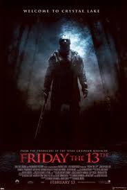
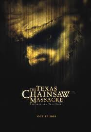
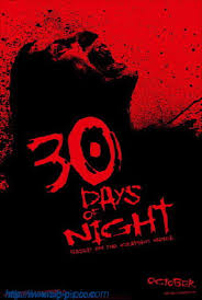
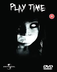
Before the creation of the poster, research was undertaken for the basic convention of a horror movie poster.
Below are some of the conventions listed:
. Horrific picture that relates to the themes of the film in order to give an in sight to an audience.
. The title is an obvious convention as it is the name of the film, and the name is also a great link to the film as it shows of the personality of it. For instance, 'Scream' shows off a thriller with the fact that there will be a lot of screaming. Another example is 'Saw', which could show off the slasher elements to the film through the gory name.
. A date is also another convention. It's purpose is obvious as the poster is an attempt to sell the film, so when it grabs people's attention they'll know when it is released, if they're interested.
. The colour schemes are also extremely important as colours can connote messages. For example, the colours black and red can be associated with death and blood.
Examples of different horror posters:

Before the creation of the poster, research was undertaken for the basic convention of a horror movie poster.
Below are some of the conventions listed:
. Horrific picture that relates to the themes of the film in order to give an in sight to an audience.
. The title is an obvious convention as it is the name of the film, and the name is also a great link to the film as it shows of the personality of it. For instance, 'Scream' shows off a thriller with the fact that there will be a lot of screaming. Another example is 'Saw', which could show off the slasher elements to the film through the gory name.
. A date is also another convention. It's purpose is obvious as the poster is an attempt to sell the film, so when it grabs people's attention they'll know when it is released, if they're interested.
. The colour schemes are also extremely important as colours can connote messages. For example, the colours black and red can be associated with death and blood.
Examples of different horror posters:
Our story with Todorov's narritive theory
The story for the horror trailer links with Todorov's six part structure thoery.
The theory is broken up into the following parts:
Eqilibrium
Disruption
Complications
Crisis
Climax
Resolution
Below is the links to our story and the narritive theory:
Equilibrium - Final girl's first day at the university.
Disruption - In the past she has commited a crime of murder that haunts her.
Complications - The person that was murdered was a close person to another person who is close by.
Crisis - An anonymous figure is after her, dressed completely hidden through his mask.
Climax - The killer is discovered by the final girl and he is killed by her, by being stabbed in the chest.
Resolution - She lies down beside a dead body and eventually sits in a cell, but is safe from the danger of the killer.
The theory is broken up into the following parts:
Eqilibrium
Disruption
Complications
Crisis
Climax
Resolution
Below is the links to our story and the narritive theory:
Equilibrium - Final girl's first day at the university.
Disruption - In the past she has commited a crime of murder that haunts her.
Complications - The person that was murdered was a close person to another person who is close by.
Crisis - An anonymous figure is after her, dressed completely hidden through his mask.
Climax - The killer is discovered by the final girl and he is killed by her, by being stabbed in the chest.
Resolution - She lies down beside a dead body and eventually sits in a cell, but is safe from the danger of the killer.
Sunday, 5 February 2012
Use of lighting when shooting the actual trailer
With lighting being one of the most important factors of filming, keeping to grips with using ot correctly was essential. We attempted to use both natural and artificial lighting.
NATUARAL LIGHTING:
The use of natural lighting was used with the establishing shot in which we picked the time of day which actually had a descent amount of light, however also contained a slightly gloomy look too, so that it would set off this energy and feeling for the genre,
ARTIFICIAL LIGHTING:
There was a prodominent use of artificial lighting to help catch out the correct look for each scene. In fact the first secenes of the trailer with the dead girls which contained the flash light look, was an interesting use of artificial light. This was because we actually didn't use a flash light but the actual LED light, but covered some of the edges to give it the effect.
In the scenes in which the killer is constantly after the final girl, the use of LED light was extremely important as it was the only source of light used, so the positioning and power was done to give maximum effect. For example, the scene in which the killer grabs the final girl and points the knife to her face, the lights position was to the side and so it also allowed the knife to glint when it was moving. Another reason the LED lighting was used without any other light, it still allowed the scene to look clear but also allowed it to look dark which related to the theme of horror extremely well, as the setting was relevant.
NATUARAL LIGHTING:
The use of natural lighting was used with the establishing shot in which we picked the time of day which actually had a descent amount of light, however also contained a slightly gloomy look too, so that it would set off this energy and feeling for the genre,
ARTIFICIAL LIGHTING:
There was a prodominent use of artificial lighting to help catch out the correct look for each scene. In fact the first secenes of the trailer with the dead girls which contained the flash light look, was an interesting use of artificial light. This was because we actually didn't use a flash light but the actual LED light, but covered some of the edges to give it the effect.
In the scenes in which the killer is constantly after the final girl, the use of LED light was extremely important as it was the only source of light used, so the positioning and power was done to give maximum effect. For example, the scene in which the killer grabs the final girl and points the knife to her face, the lights position was to the side and so it also allowed the knife to glint when it was moving. Another reason the LED lighting was used without any other light, it still allowed the scene to look clear but also allowed it to look dark which related to the theme of horror extremely well, as the setting was relevant.
Locations
There were many different locations used in shooting the trailer. In actual fact the locations changed. At first we were to shoot some of the trailer at Leanne (one of the student's in the group) house, however we decided to re do the shooting within the premises of the college. This was because space was limited and there was more of a variety of rooms within the college. Furthermore, the whole look of the college allowed us to portray a similar university setup, with corridors and learning facilities.
List of locations in the college used for the trailer:
Establishing shot of the college gives the audience an idea of the location of where the film is set.
College halls - We shot some scenes within the college hallways, however ended up scrapping the scenes die to there not being enough darkness.
College Kitchen - Took shots of the killer picking up the knife.
Classrooms - Shots were actually taken within class rooms with both the killer and the final girl.
Media Studio - The shots of the two girls dead were shot in this studio, and some shots of the killer were also shot here.
List of locations in the college used for the trailer:
Establishing shot of the college gives the audience an idea of the location of where the film is set.
College halls - We shot some scenes within the college hallways, however ended up scrapping the scenes die to there not being enough darkness.
College Kitchen - Took shots of the killer picking up the knife.
Classrooms - Shots were actually taken within class rooms with both the killer and the final girl.
Media Studio - The shots of the two girls dead were shot in this studio, and some shots of the killer were also shot here.
Subscribe to:
Posts (Atom)